The Psychology Of Colours In Graphic Design: Crafting Emotional Connections
- - Category: Marketing Tips
- - 05 Mar, 2024
- - Views: 184
- Save
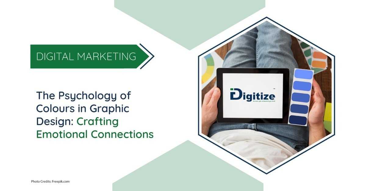
Colours are not merely visual elements but powerful tools that can evoke emotions convey messages and captivate audiece
In the realm of graphic design, colours are not merely visual elements but powerful tools that can evoke emotions, convey messages, and captivate audiences. As we embark on a journey through the psychology of colours and the art of contrast, let’s delve into the intricacies of nine key colours and their impact on audience perception and engagement.
The Psychology of Colours: Building Bridges of Emotion
Each colour possesses its unique personality, carrying with it a spectrum of emotions and associations. Here’s a closer look at the nine colours and their significance:
1. Red: Radiating passion and urgency, red commands attention and evokes feelings of love, power, and intensity. It’s a go-to choice for brands needing to convey strength and action.
2. Blue: Symbolising trust and reliability, blue instills a sense of peace and professionalism. Corporate brands often embrace it to inspire confidence and stability.
3. Yellow: Like a burst of sunshine, yellow exudes warmth and optimism, instantly brightening moods and conveying cheerfulness. It’s a favourite among brands aiming for a friendly and approachable image.
4. Green: Representing growth and harmony, green symbolises balance and vitality. Brands in the health, wellness, and sustainability sectors utilise it to convey well-being and eco-friendliness.
5. Purple: Associated with luxury and creativity, purple exudes elegance and sophistication. It’s often chosen by luxury brands and artistic ventures to evoke prestige and refinement.
6. Pink: Radiating femininity and tenderness, pink appeals to the heart, evoking feelings of affection and romance. It’s commonly used to create intimacy and connection, especially for brands targeting a youthful or female audience.
7. Orange: Bursting with energy and creativity, orange commands attention and sparks excitement and spontaneity. Brands looking to make bold statements often incorporate it into their designs.
8. Black: Symbolising sophistication and authority, black adds an air of mystery and elegance to designs, making them appear sleek and modern. Luxury brands frequently use black to convey exclusivity and sophistication.
9. White: Signifying purity and simplicity, white creates clarity and openness. It serves as a blank canvas for creativity and allows other colours to pop with intensity. Brands seeking a minimalist aesthetic often incorporate white into their designs.
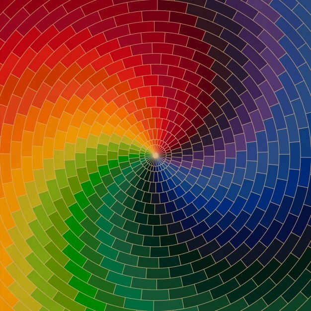
How do you pick the right colours for your brand?
When selecting colours for your designs, consider your target audience’s preferences, cultural associations, and the emotional response you aim to evoke. By choosing colours that resonate with your audience and reflect your brand identity, you can create a powerful visual language that enhances brand perception and fosters meaningful connections.
What is a company’s colour palette?
Crafting a company’s colour palette involves meticulous research into target demographics, industry trends, and competitors. This ensures alignment with your brand’s personality and mission, fostering recognition and trust across all platforms. Each colour is chosen for its emotional impact, aiming to evoke desired feelings and associations. The palette should be versatile yet coherent and adaptable to various contexts. Ultimately, a well-crafted colour palette serves as a tool for building brand recognition, forging emotional connections, and fostering long-term loyalty.
Colour Contrast in Graphic Design: Elevating Visual Impact
In addition to understanding the psychology of colours, mastering the principles of colour contrast is essential for creating visually striking designs that capture attention and communicate effectively. Here are some key contrast techniques to consider:
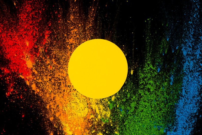
1. Brightness Contrast: Varying the brightness or intensity of colours creates stark contrasts that immediately draw the eye. Pairing light and dark hues can highlight important elements and create depth in your design.
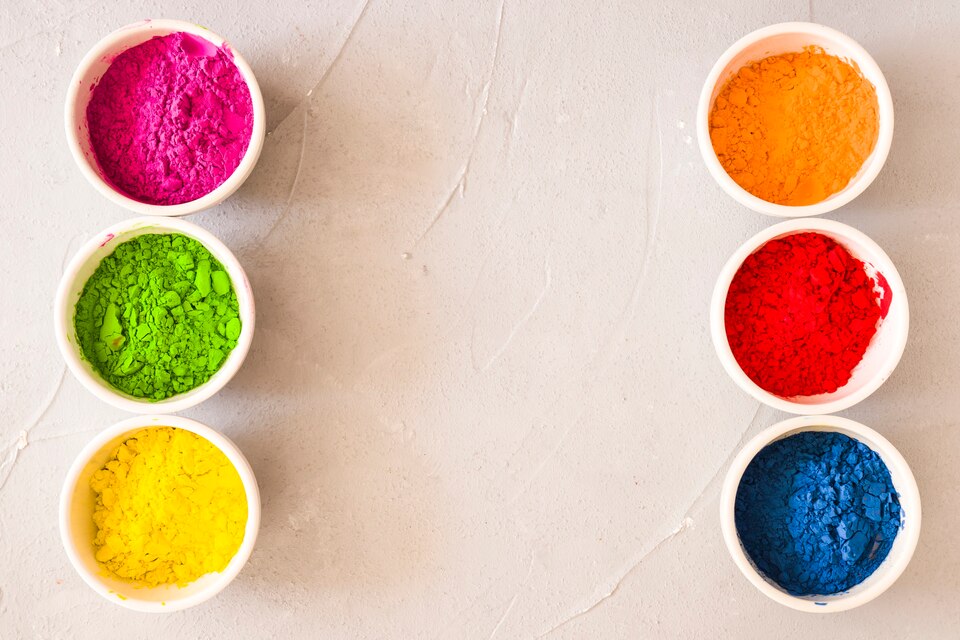
2. Complementary colours: Combining colours that are opposite each other on the colour wheel creates vibrant contrasts that demand attention. This technique is particularly effective for creating dynamic visuals and emphasising key messages.
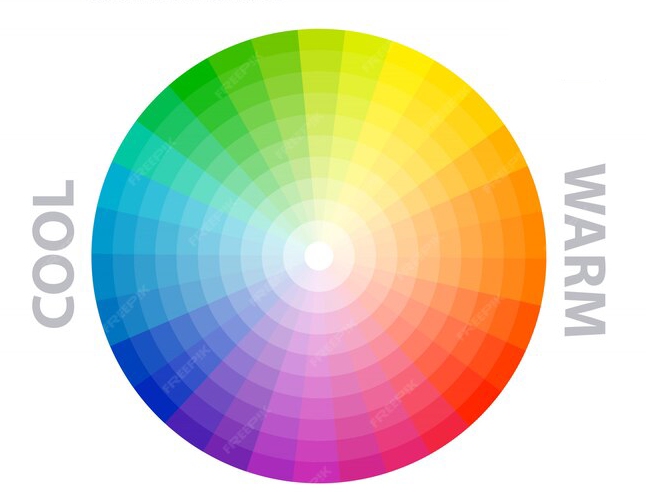
3. Warm vs. Cool: Contrasting warm colours (e.g., red, orange, and yellow) with cool colours (e.g., blue, green, and purple) creates a visually striking juxtaposition that adds visual interest and dimension to your designs.
4. Size and Shape Contrast: Beyond colour, varying the size and shape of elements in your design can also create contrast and hierarchy, guiding the viewer’s eye and emphasising important information.
By strategically incorporating colour contrast techniques into your designs, you can ensure that your visuals not only capture attention but also effectively communicate your message to your audience.
Summing Up:
In conclusion, the art of colour selection and contrast in graphic design is a delicate balance of science and artistry. By understanding the psychology of colours and mastering the principles of contrast, designers can create visually captivating designs that resonate deeply with their audience and leave a lasting impression. So, let your creativity soar as you paint with the vibrant hues of red, blue, yellow, green, purple, pink, orange, black, and white, and watch as your designs come to life in captivating ways.
At Idigitize, we pride ourselves on being the best graphic design company. Let us help you discover the perfect colours to make your brand truly stand out.
BE SEEN, GET CONNECTED, GO VIRAL!

