7 Graphic Designing Mistakes To Avoid
- - Category: Graphic Design
- - 29 Dec, 2020
- - Views: 911
- Save

During this pandemic time, Online marketing and graphic designing as a whole has increased 3 folds.
From social media creatives and website designing to grouping various promotional activities is gaining tremendous attention. Due to this, there are many opportunities to put on your creative hat and grow your business. Whether you intend to design for a product mockup, a new logo or putting together some print marketing for a new campaign, creating new artwork isn’t that easy. It requires tedious brainstorming and gaining inspiration from the internet. This blog attempts to put together some of the most common graphic design mistakes and how you can avoid them.
Mistake 1: Utilizing Too Many Fonts
The first mistake that will grab all the attention between a casual design and a professional design is the number of fonts used. The viewer will find it extremely difficult to understand and relate to the artwork if there are too many distracting fonts involved in the same graphic. Many brands find it a fun filled activity to play around with fonts in order to convey different feelings and messages, they must also consider simplicity.
What can you do to avoid this problem?
- We recommend you pick up two or three fonts maximum which you can use throughout your Online marketing campaigns Be it your website or your social media pages or your print media. They all make sense when they create a similar impact with well thought fonts. Using a stand-alone font can also prove successful since it adds continuity and establishes your brand identity.
- As a branding expert you also need to keep in mind the size of the graphic and decide the content heaviness. A poster would need more bold fonts with more content compared to a social media graphic. A logo generally has 1 font incorporated which is used in the tagline section, while larger or more complex artwork like your website can handle a little more creativity.
- Also, keep in mind the kerning of your fonts. Kerning means the spacing between the letters, which impacts the finished creative artwork. Playing around with the space between letters can make the words more legible and help the overall creative to look esthetically appealing.
Mistake 2: Using Paid Stock Images For Free:
There are various websites which provide you with good quality paid stock images. This means you search for relatable images and then pay for it. Many brands to avoid the expense, use them by not paying the respective website for the image. This results in a shabby looking image with the watermark on it. The image below is an illustration of the same and we do not recommend you using them. We are using them just to demonstrate what a paid stock image watermark looks like on an image.
What can you do to avoid this problem?
- There are various free stock images websites which provide you with good quality images for free which you can utilize for your creatives without any legal obligations. They have a free download option for certain images and certain images have a paid download option. We recommend you use the free download images only to avoid legal scrutiny. Free Stock image websites: Pixabay, Pexels, Freepic, etc.
Mistake 3: Not Proofreading:
A brilliant artwork with casually written content on it is as good as a paper in the trash. We recommend you ensure double checking over the spelling and grammar before sending a piece to print or pushing an email. You may think a misused comma or other punctuation marks to be a minor error which can be overlooked, but there are many people who possess an eye for detail and will notice common mistakes. This is a turn off for many and the rest of the message will be ignored. For example, if you are designing pamphlets for an event and your ad has many spelling mistakes in the text, it will backfire and you may have scanty footfalls for that event. Not all your customers will take these spelling errors lightly. These customers will not leave an opportunity to label your business as unprofessional.
What can you do to avoid this problem:
- While you are working on a particular graphic, your eyes tend to develop a barrier towards errors as you have been seeing it all day long. So, get a second pair of eyes on your work; have your colleagues run through your copy and hopefully they will catch any proofreading errors you might have missed the first time!
- You can also use various free spelling and grammar correction tools like MS Word – Spell check tool and Grammarly as an extension to your browser.
Mistake 4: Choosing The Wrong Colour Combinations:
Similar to mistake Number 1: Utilizing too many fonts, choosing too many colors or choosing the wrong color combinations will make your creative ineffective. More than good, it will do bad by acting as a distracting element in your creative piece. We recommend using minimum bold/dark colors in one piece.
What can you do to avoid this problem?
- So before you go ahead creating new branding elements for your company/brand or new artwork, it’s important to start by creating a color palette. Start with narrowing down a primary color and a secondary color. Each color palette you create must include both your defined primary and secondary colors. Also, test your pre-defined fonts along with these colors to make sure that the text is legible. Use Coolors to create your color palette online for free and then use Colourhexa to understand which other colors will complement your primary and secondary colors.
Mistake 5: Using Incorrect Chronology:
In graphic design, hierarchy is how a creative is organized so the audience knows which elements are the most important and how their eyes should move over the creative. Image a graphic that has contact details on the top in really big font size and the product or service details below in tiny font size? You would definitely not even glance through the product and service information. There are 2 flows to a flyer or a graphic: 1. Top to down 2. Left to right. If you follow the most important content to be on the top and left it is easy for the eye to navigate and ensures your audience can find the most important information right away.
Your graphic should not be a roller coaster ride for the audience where they are expected to eye jump around looking for the important information.
What can you do to avoid this problem?
- Hierarchy is the top design technique that ranks the importance of your information one after the other. Whenever you’re creating a new design there is typically one general message you want to focus on communicating Eg: Flash Sale. Creating the correct hierarchy of text and design will ensure your audience takes away the quality message from your design. Hierarchy doesn’t just have to be font size or placement, you can also create an effective hierarchy through colors, graphic elements, or the weight of the fonts you use. You can ideally get 2 or 3 colleagues to run an eye through the designed creative and take their suggestions for improving design chronology.
Mistake 6: Designing Without Knowing The Medium
Before you even start brainstorming on the design flow and pattern you need to chalk down the medium i.e. where will it appear. Whether it will be used on social media platforms, on your website, or printed in a magazine/newspaper can make a big difference in how you should be creating your design. If you created a design in one format and printed or published it in the other it would look completely different because the colors wouldn’t translate! Which will lower the effectiveness of the creative.
What can you do to avoid this problem?
- If your design will be used for print media, you will need to use CMYK color mode which stands for cyan, magenta, yellow, and key (black) which is used for four-color process printing.
- If you are designing for it to appear on a digital screen (like on tv, computer, phone, or tablet) it should be created in RGB, which stands for red, green, and blue.
Mistake 7: Saving In An Inappropriate Media Format
When choosing a file format for your design image, think about whether or not the image needs to be in raster or vector format. Raster images are made up of pixels while vectors are made up of geometric lines and curves, which means they can be scaled to any size while keeping their shape intact.
What can you do to avoid this problem?
- Take into consideration whether the design will be used for print media or displayed online; all of these things will make it easier to choose the perfect way to save work.
- You must keep in mind a good rule of thumb if you are worried about your design getting pixelated, make your design bigger than it needs to be. You can always reduce resolution, but you can never increase it.
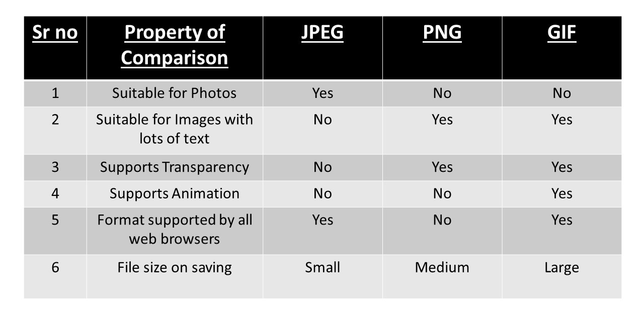
- Knowing the various formats of media will help. The three most common file types for web-based images are .jpeg, .png, and .gif. Here’s a rundown of what makes each one of them different.
- JPEG – JPEG images are ideal for files with gradients and allow for a smaller file size through compression.
- PNG – PNG images are lossless, so they do not lose quality during editing, support transparency, and tend to be larger than a JPEG.
- GIF – GIF images can maintain a low file size while being able to support animation.
These above mentioned critical elements will aid you to create bespoke graphics. If you need help with your next design project, check out iDigitize Graphic Designing services. We house professional designers that can help you with everything from new logos to unique advertisements campaigns keeping up with latest and upcoming graphic designing trends.
