The 5 Rules Of Graphic Design Hierarchy
- - Category: Visual Art
- - 30 Dec, 2022
- - Views: 489
- Save

A well-structured graphic design hierarchy can help to communicate complex messages in a concise way
Graphic design is an important tool for marketing, advertising, and communication. It can be used to create a compelling message and attract customers to a product or service. But it takes more than just good ideas to make a successful design; understanding the principles of graphic design hierarchy is essential. Graphic design hierarchy encompasses the rules and techniques that organize elements of a design in order to create an effective visual message.
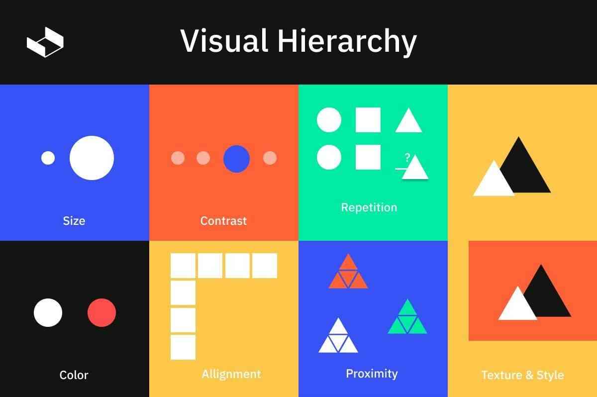
Graphic Design Hierarchy
Graphic design hierarchy is an important concept for any graphic designer to understand. It's not only important for creating visually appealing designs, but also for communicating a message effectively. The rules of graphic design hierarchy are based on the idea that some elements should take precedence over others in composition. By applying these principles, designers can make sure their work stands out and captures the attention of their audience.
The first rule states that eye-catching elements such as color and contrast should be used to draw attention to the most important parts of a design. Bold fonts and larger sizes can also help create emphasis, as well as strategic placement within the composition itself. This helps ensure that viewers will quickly notice what they need to and then focus on other details in the design accordingly.
Rule 1: Contrast and Proportion
When it comes to graphic design, the most important rule is contrast and proportion. The contrast between elements in a design can provide visual interest while defining hierarchy. The use of size, weight, color, shape, and texture are all fundamental ways to create contrast within a design. When establishing a hierarchy with these elements, it’s essential to maintain balance. Designers must take into account the overall proportions of each component in order for the intended message to be communicated clearly and effectively.
To achieve successful contrast through proportioning, designers need to determine appropriate sizing that will draw attention without overpowering other elements on the page. This can be done by arranging components into dynamic shapes or creating compositions that allow for plenty of white space around the focal point of an image or text block. Applying principles such as scale and alignment will also bring harmony and continuity to any design project.
Rule 2: Alignment
Alignment is an important design rule to adhere to when creating a successful visual hierarchy. It is the arrangement of elements on a page or within a design in relation to each other and the overall composition. Aligning elements correctly creates order and brings harmony between various components by making them appear visually connected. This makes it easier for viewers to connect with the message of the design, as well as helps guide their attention throughout the piece.
When designing with alignment, it’s important to consider how components are placed relative to each other; too much randomness will create confusion while too much uniformity may be boring or uninteresting. Consider using margins, columns, grids, and other guides to help create an organized layout. Additionally, use consistent spacing between elements so that nothing looks out of place or overcrowded on the page—this will make sure your design looks polished and professional.
Rule 3: Color Usage
Graphic design hierarchy is best understood when broken down into the rules that govern it. Rule 3 of the graphic design hierarchy focuses on color usage. To ensure effective communication, designers should understand how to use color in their designs. Color can be used to emphasize the importance and create a distinctive visual identity for a brand or product. It is also important to remain aware of context when using colors as they can convey different meanings depending on the cultural background of an audience.
Bright and vibrant colors are often used as a way to draw attention and can create excitement around a product or message while muted tones provide stability and evoke feelings of trustworthiness. Color choices should be based on the desired outcome – understanding what message you want your audience to take away from the design is key in order to selecting appropriate shades that will resonate with them.
Rule 4: Typography
Typography is a very important element in graphic design and it can help to draw attention to the most important information on the page. It is also an integral part of conveying any message visually. Proper use of typography ensures that readers clearly understand what they are looking at and read through the content more easily.
When selecting the right typefaces, designers should consider factors such as contrast, balance, hierarchy, and legibility. Bold font weights can be used to emphasize certain words or phrases but should not be overused as this could make text look messy or distracting. Careful selection of fonts will also ensure that there are no issues regarding legal rights when using them for commercial purposes. Ultimately, typography helps to create a better user experience and adds visual appeal to any project or design piece.
Rule 5: Imagery & Graphics
The fifth and final rule in the five rules of graphic design hierarchy is imagery and graphics. This rule speaks to how artwork, images, symbols, and other visual elements are used to enhance a design. Imagery and graphics can be used in a number of ways; they can be used to highlight key points or to create emphasis on certain pieces of information. When it comes to creating a successful design, imagery and graphics should not be overlooked as they offer an eye-catching element that will draw attention from viewers.
To ensure success when using imagery and graphics within your design, consider selecting visuals that are appropriate for the message being conveyed. For example, if your goal is to emphasize the importance of safety then you may want to incorporate a symbol such as a stop sign or caution tape into your design.
Conclusion
The 5 Rules of Graphic Design Hierarchy have been discussed and now it’s time to draw a conclusion on what makes an effective hierarchy. A well-structured graphic design hierarchy can help to communicate complex messages in a concise way that is easy for audiences to understand. To be effective, designers should prioritize the elements they are working with and create visual cues to separate them into distinct groups.
Balance is also important, as viewers need clear points of focus within the image or page layout before they can start exploring further. Color and contrast can be used in combination with size or shape to draw attention to the most important element of the design. Lastly, consistency should be maintained throughout each project so that viewers don’t become confused by conflicting visual styles or directions.
Hope you found something valuable in this article, if you like it, please help me to share it with others too. I'd much appreciate it. Please leave me some comments and tell me what you think. Thank you for reading.